Print in Store
End-to-end service design for Hermes self-service kiosks — reducing drop-off, removing friction, building confidence.
Service design and interaction redesign for Hermes self-service print kiosks. The challenge: a high-traffic, high-pressure physical touchpoint with poor completion rates and constant staff escalation. The solution: structural clarity, redesigned flows, and zero room for doubt.
- User research
- Journey restructuring
- Interaction design
- Design system alignment
- Prototype development
Measurable service impact
Failed returns — customers completing without staff help
First-time completion rate on the return flow
Staff intervention calls per device per day
Pre-arrival clarity — customers arriving label-ready
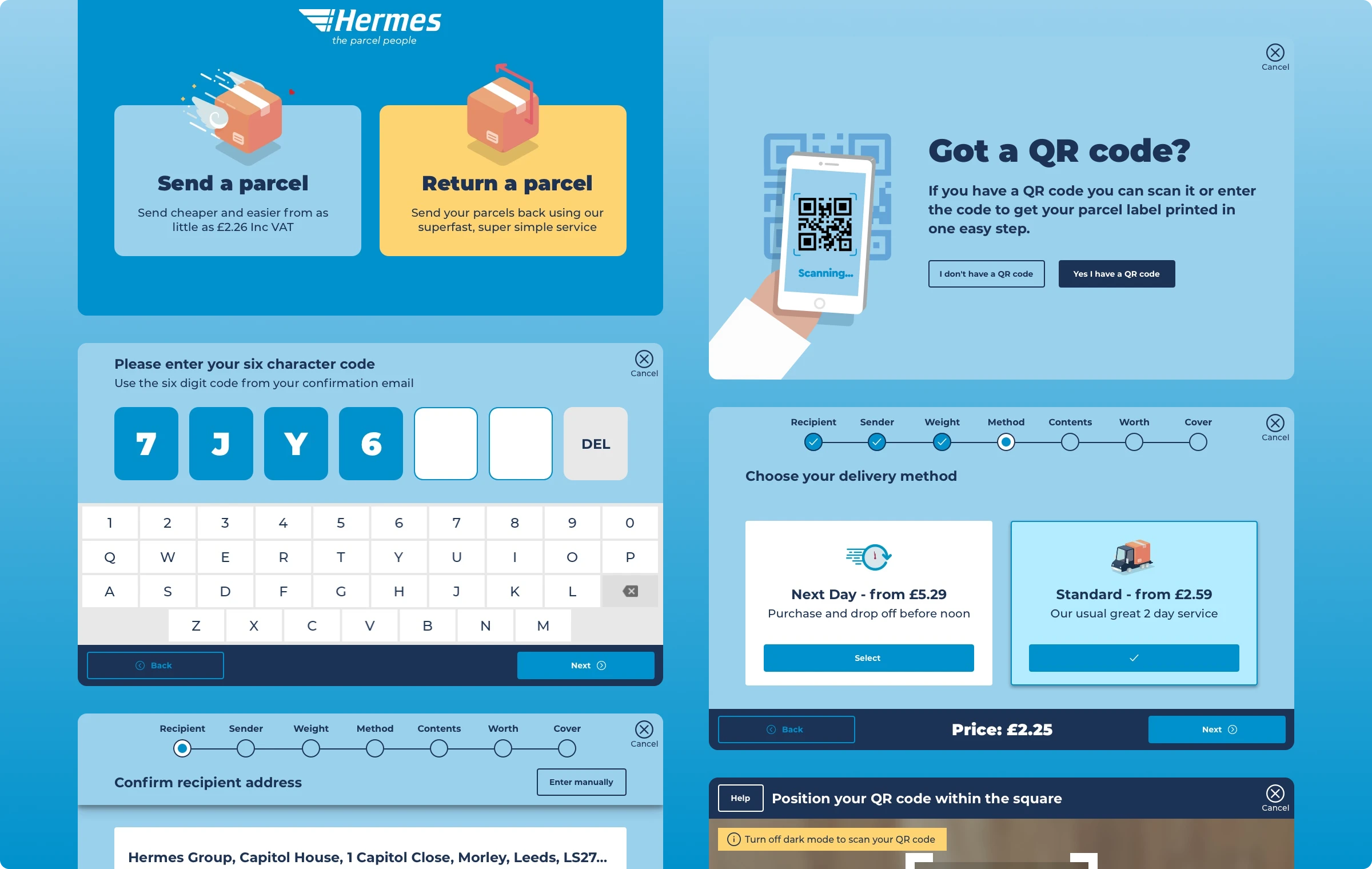
The interface worked.
The service didn't.
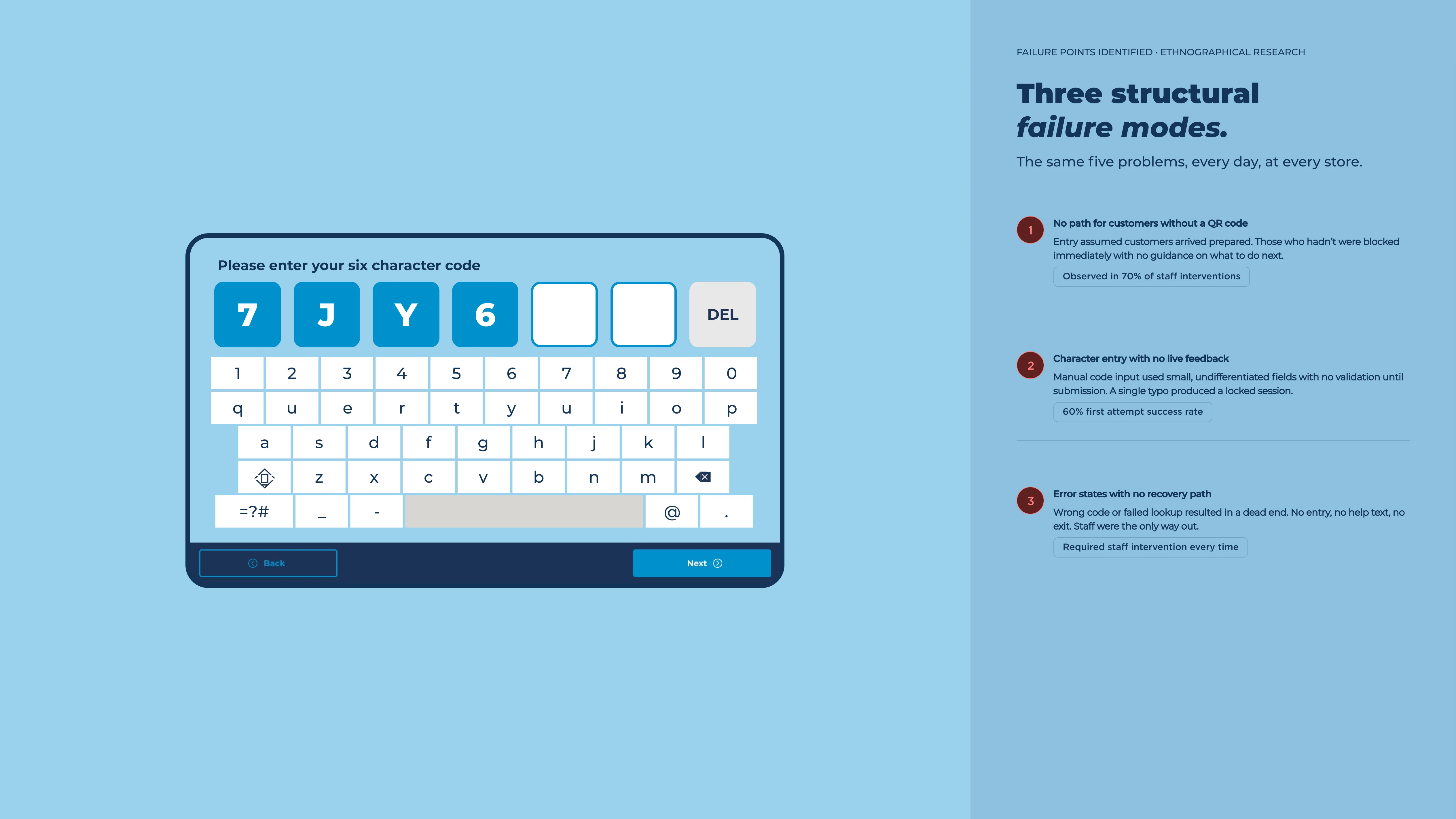
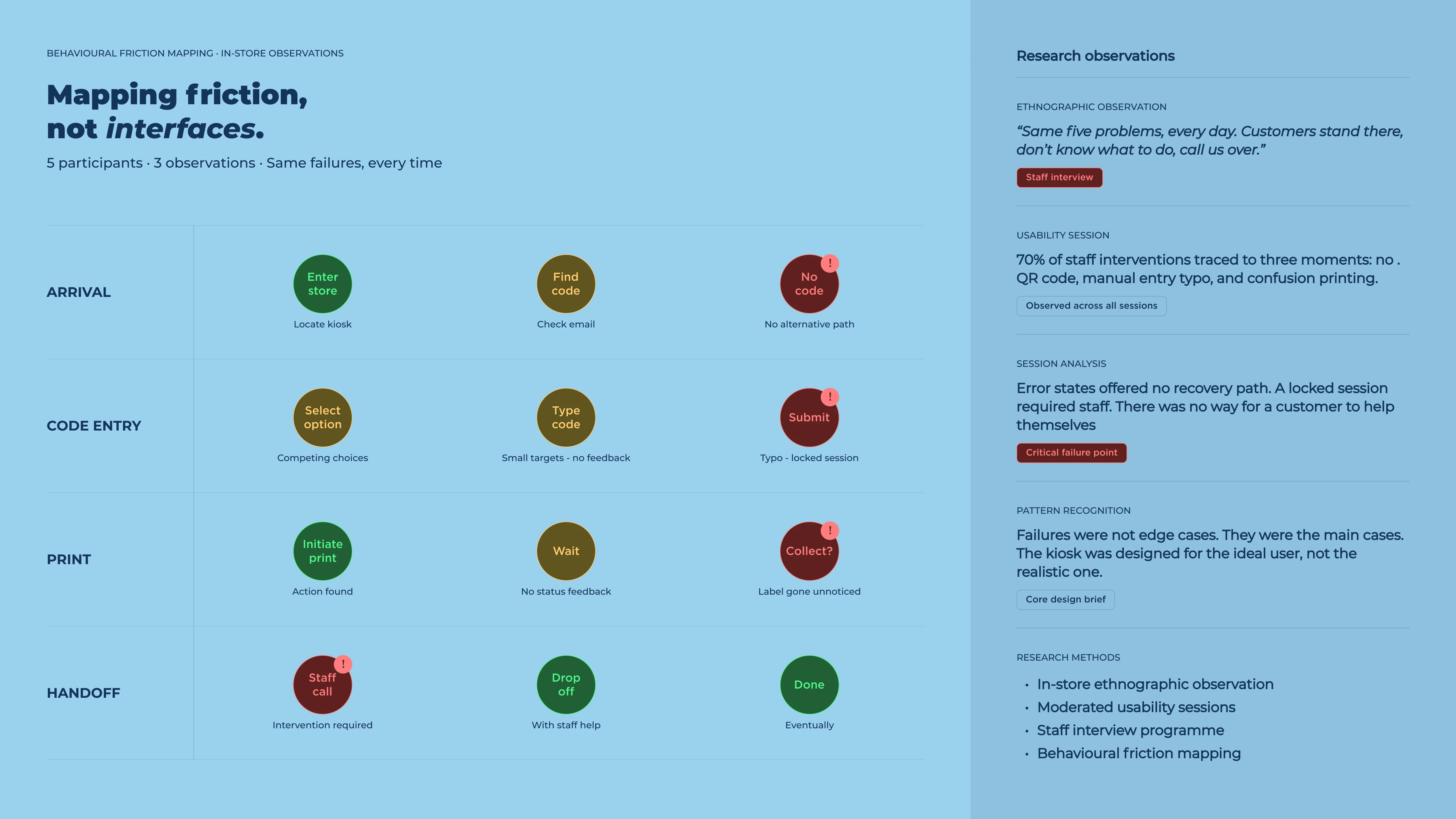
The original kiosk had functioning buttons and a logical task order. Customers could technically complete a return. In practice, failure rates were high and staff escalations were constant — the same five problems, every day.
Three failure modes dominated: customers arrived without a QR code and the kiosk offered no alternative path. Character entry demanded perfect input on small targets with no feedback. And there was no recovery — a wrong code locked the session with no visible exit.
"We're standing there doing nothing for an app that should handle it itself — same five questions every time."
Store staff member, ethnographic research session
Staff observed that most interventions came down to the same moments: no code, a typo, or uncertainty about whether anything had printed. None of these were edge cases. They were the main cases.
Three structural fixes. One coherent journey.
Rather than redesigning the visual layer, the work focused on correcting the underlying journey architecture. Three distinct failure points, each with a targeted structural solution.
Pre-arrival preparation
A lightweight check at entry — confirm your retailer, confirm you have what's needed. Stops failures before they start.
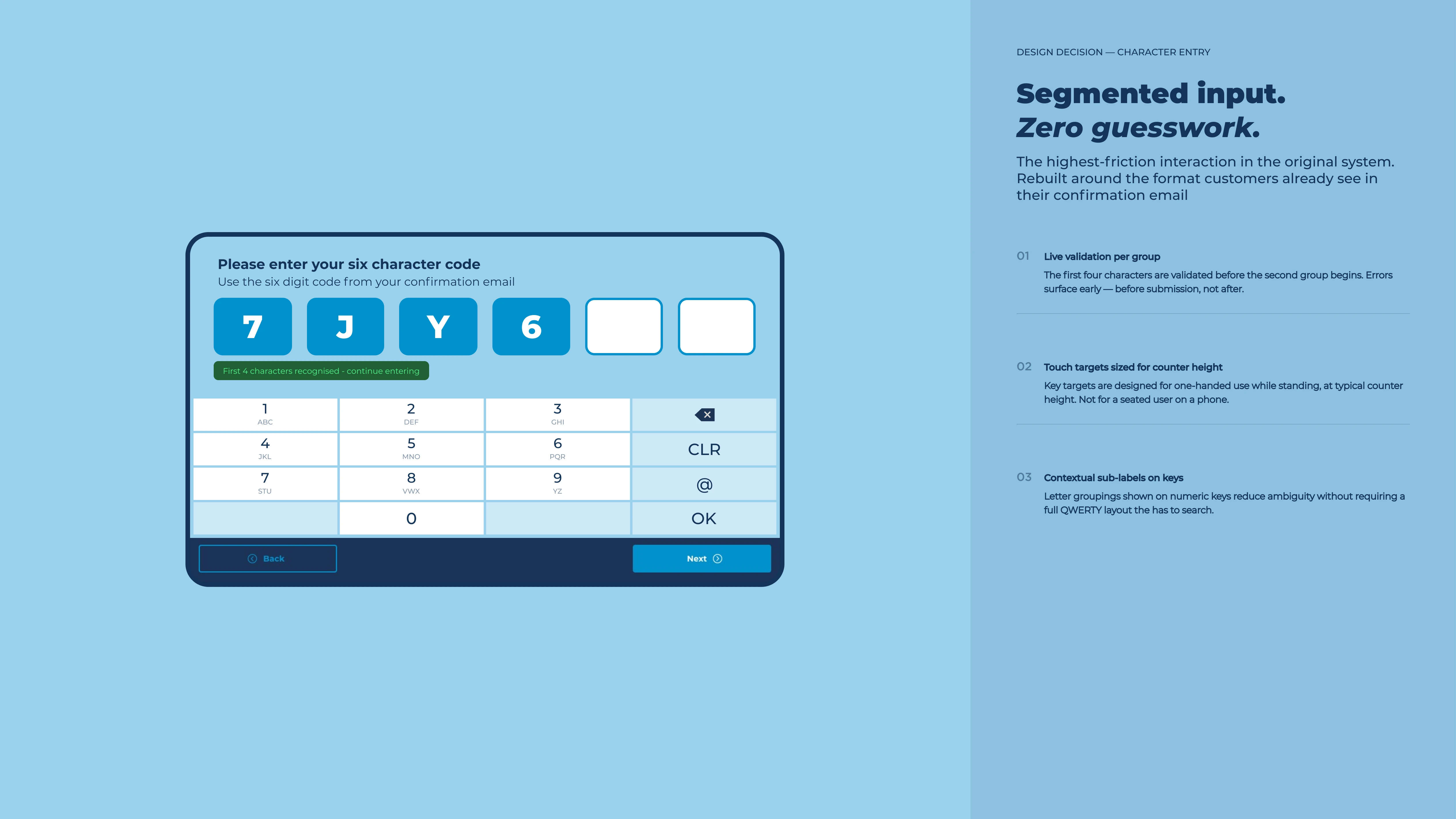
Forgiving input design
Character entry redesigned with larger targets, real-time feedback, and clear field segmentation. The interface teaches the right format without demanding it.
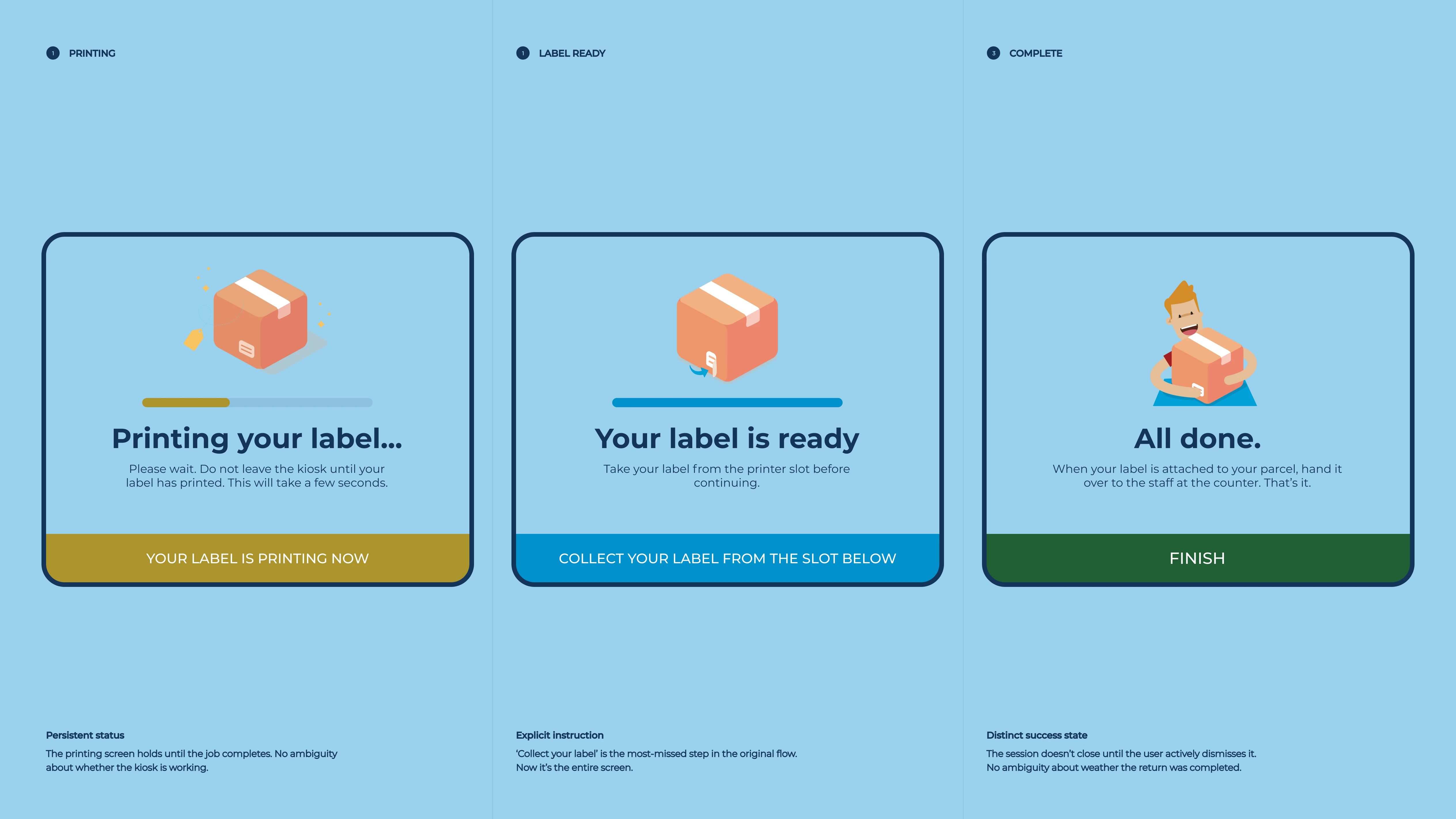
Visible confirmation
Print confirmation made undeniable — a persistent status, explicit instruction to collect the label, and a distinct success state that holds until it's taken.
Check retailer eligibility
Customer confirms they're returning to a supported retailer. Surfaces incompatible returns before any code is entered.
Code entry — QR or manual
Primary path uses camera scan. Manual entry with segmented fields and live error correction. Both paths converge on the same confirmation screen.
Label print confirmation
Persistent status screen holds until print completes. Explicit instruction to collect label before leaving removes the most common confusion event.
Drop-off and done
Clear handoff to staff at counter. Session closes with a timestamped confirmation.
Interface design
The interface was simplified to reduce visual noise and strengthen hierarchy. Primary actions became unmistakeable. Secondary actions stepped back. Progression was visible at every step.
The code entry screen was the single highest-failure interaction in the original system. The redesign replaces a numeric keypad with a full QWERTY layout. Alphanumeric codes are typeable without hunting. Entered characters are displayed large above the keyboard, filled fields distinct from empty ones at a glance. Progress is visible. Errors are immediately obvious. No submission needed to know something went wrong.
Design system
Component consistency was improved to reduce ambiguity in buttons, feedback states and confirmation messaging. Interaction patterns were aligned with the broader Hermes digital ecosystem — ensuring the kiosk felt like part of a unified architecture, not a standalone system.
The paid returns flow received the most structural attention. Single and multi-parcel journeys were separated at entry so the correct pricing logic, label output and parcel limits applied from the first step. Cost and terms appeared before commitment. Confirmation states were definitive, not vague.
Results across the full estate
Transaction volume
+34%More customers completing returns unaided — increasing throughput at each device without additional hardware.
Staff time recovered
~8 minPer device per day returned to the floor — across 2,400+ parcel shops, that compounds quickly.
Accessibility
WCAG 2.1First version of the kiosk to meet AA contrast and touch-target standards across the full user flow.
Rollout scale
2,400+Parcel shops live with the redesigned interface, covering the full Hermes (now Evri) partner estate across the UK.
Designing for
the realistic user.
The biggest design decision was accepting that most users would arrive partially unprepared. The service had been built for someone who'd read all the instructions. The redesign started from someone who hadn't.
This meant front-loading help before failure rather than offering rescue after it. Success was measured by staff intervention rate in the real estate, not completion rate in a lab.