APG
Real-time operational intelligence for 150+ airline offices worldwide. Complexity made legible.
Dashboard design for APG — giving 150+ airline offices real-time visibility into sales performance, yield trends and competitive positioning. The challenge: operational data at global scale, presented with enough clarity that decisions take seconds, not meetings.
- Discovery facilitation
- Information architecture
- Visual design
- Design system components
- Interactive prototype
- Stakeholder presentation
- Build strategy consultation
The scope of the problem
Airline offices worldwide without a unified performance view
Countries in the APG network — each office operating in isolation
Core friction areas: lead visibility, revenue management, operational tracking
Prototype delivered and validated at APG World Connect
Making global performance visible and actionable.
APG is the world's largest airline services agent, operating across more than 150 offices worldwide. Despite its scale, the network struggled to understand office performance quickly enough to drive corrective action.
Head Office relied on slow, manual processes for collecting and analysing data. Offices lacked transparent benchmarks — no way to understand their performance relative to peers. Revenue management, load tracking and cash settlement were fragmented across systems, often requiring email coordination and manual follow-ups.
The problem was not data scarcity. It was data fragmentation. The information existed. No one had built a system to surface it.
Three intelligence areas. One operational view.
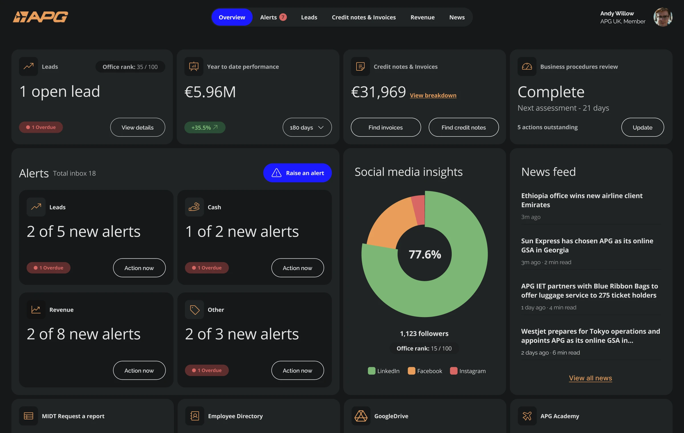
The strategy centred on creating an office-focused experience that surfaced only what mattered most. Rather than replacing existing systems, the work centralised operational intelligence into a single, actionable overview.
Office-first focus
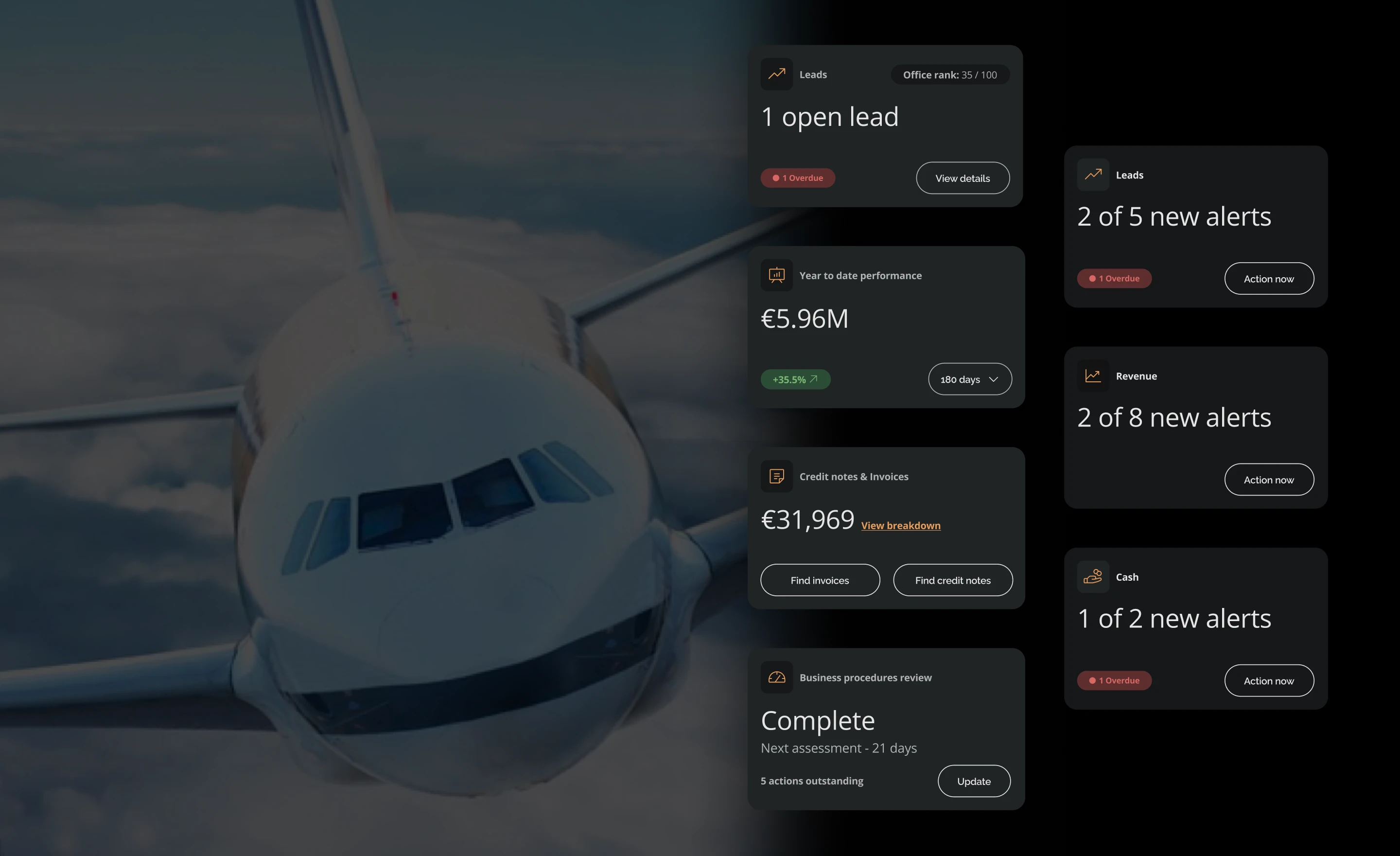
The dashboard was designed for office managers, not head office. Surface only what matters most, in a format that enables decisions in seconds — not via a meeting or an email chain.
Prioritise alerts
Leads, cash, revenue and process flags categorised and visually distinct. Rapid triage without losing context — so office managers know exactly where to act first.
Comparative intelligence
Offices ranked against network peers. Benchmarking introduced constructive competition — and gave head office a clearer picture of where support was needed most.
Discovery
Three core friction areas identified across the network: lead performance visibility, revenue management and operational tracking — each fragmented across disconnected systems.
Phase 1 prioritisation
High-impact dashboard scope agreed: revenue performance, cash alerts, lead status and business-procedure reviews. The 20% of information that drove 80% of the decisions that mattered.
Prototype
Interactive prototype built on assumed data structures — tangible and testable without waiting for full data integration. Maintained momentum and reduced stakeholder risk.
Validation at World Connect
Structured feedback gathered at APG World Connect. The prototype refreshed APG's internal performance culture and provided a clear direction for Phase 2 development.
Dashboard design
The interface prioritised clarity and hierarchy. Leads, revenue and cashflow appeared first. Alerts were visually distinct, allowing offices to triage quickly without wading through noise.
Comparative insight reinforced performance by showing how offices ranked against peers. Benchmarking introduced constructive competition — and gave managers a clearer picture of where they stood within the network.
System architecture
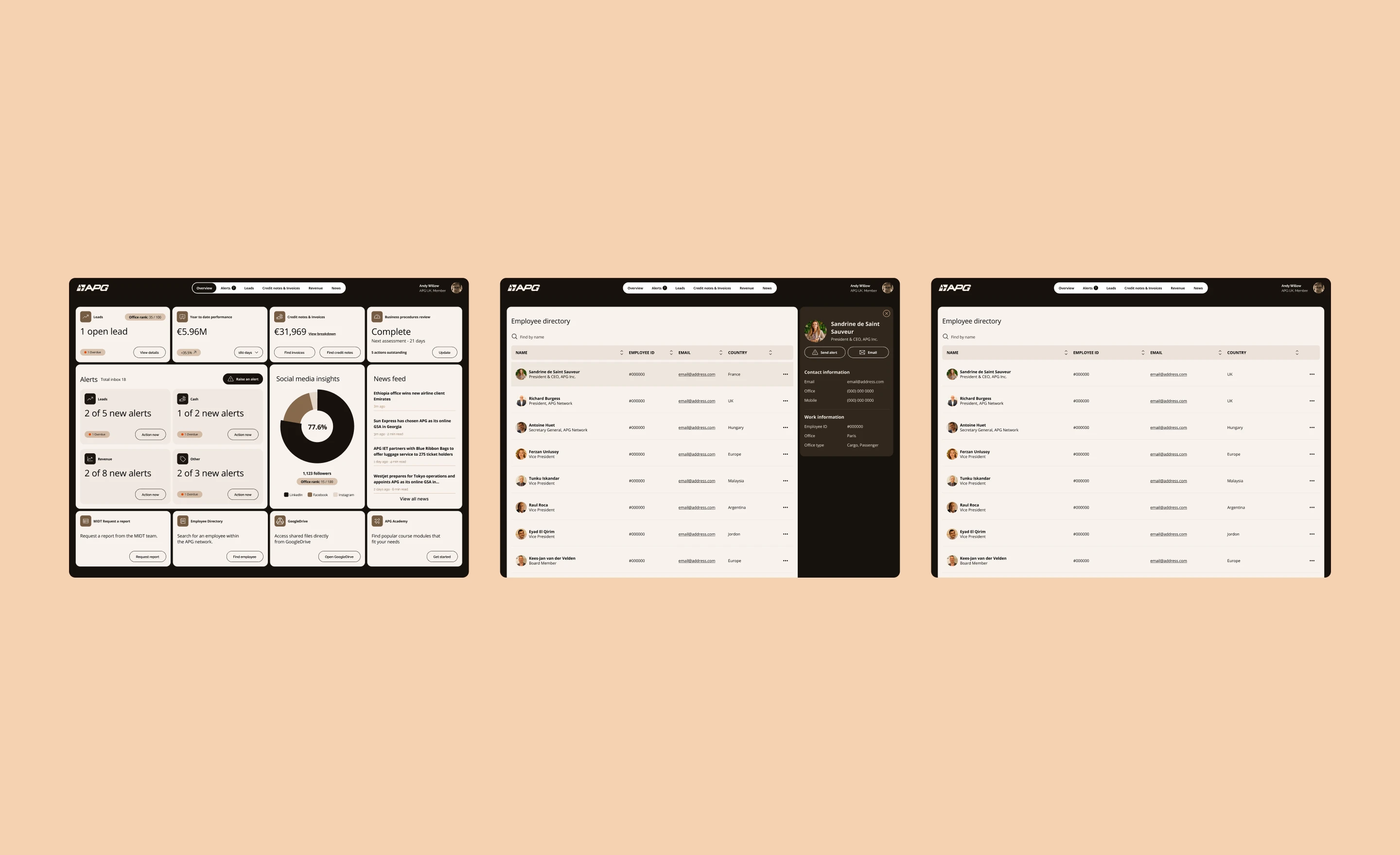
The dashboard was modular, allowing expansion into additional reporting areas — social media insights, product-specific revenue views, automated threshold alerts. The system was structured to evolve as data access improved and integration matured.
Additional integrations — MDT reporting, employee directory access, Google Drive links and APG Academy — surfaced within the portal to centralise operational tools alongside performance data.
Operational data made legible
Alert structure
OrganisedStructured alert tagging across offices reduced reliance on email chains and informal coordination for the first time.
Revenue benchmarking
VisibleManual comparison of office performance introduced across the network. Context created, not just data — offices could see where they stood.
MDT access
One clickBusiness-procedure review accessible directly from the office overview — eliminating the multi-system navigation previously required.
Phase 1
DeliveredPrototype showcased at APG World Connect. A tangible end-to-end experience that demonstrated the system's potential and shaped the Phase 2 roadmap.
Operational data at global scale,
made legible.
The data existed. The problem was that no one had built a system to surface it. The dashboard wasn't about adding more information — it was about making the right information findable before the meeting started.
When performance is visible, accountability follows naturally. The goal was clarity, not pressure. Office managers who can see where they stand can decide what to do next.