Pickle.
iOS and Android product design for a platform that turns reactive homeowners into confident, proactive ones.
Native iOS and Android app design for Pickle — a home maintenance platform built around one core insight: most homeowners aren't disorganised, they're overwhelmed. Three rounds of structured usability research, run across the full design process, shaped every major decision. The result: a calmer, more confident product that reduced task completion time by 36% and earned a SUS score of 75 — exceptional by industry standard.
- Product strategy
- Native Android & iOS app design
- Information architecture
- Content optimisation
- Premium funnel design
- Marketing site
- User testing
- Desktop prioritisation
Three rounds. Measurable results.
Completion time — home care plan flow, Round 1 to Round 2
SUS — System Usability Scale, classified as exceptional
Task completion — social sharing feature in Round 3 testing
Conversion rate at $12.38 customer acquisition cost
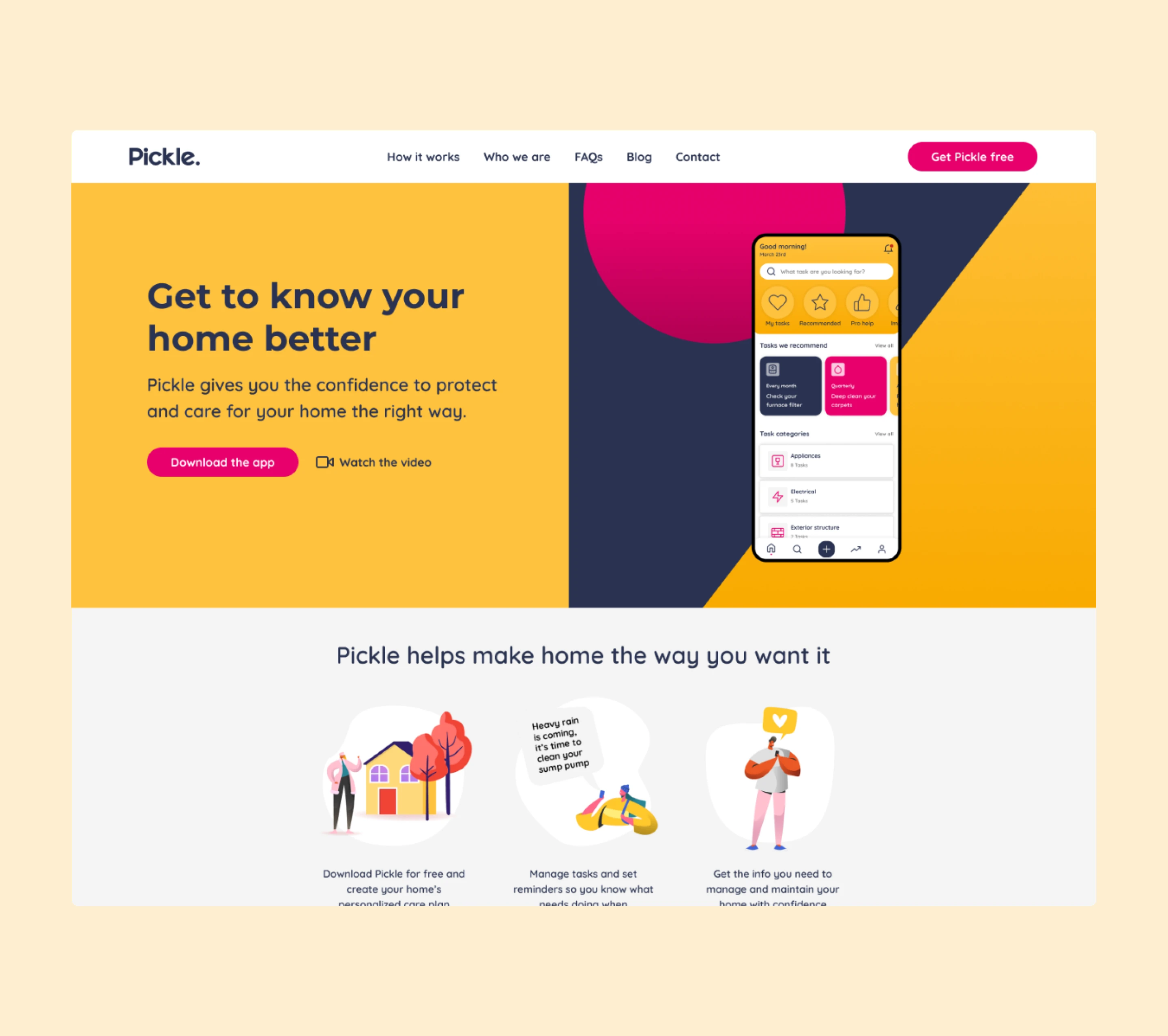
Changing reactive homeowners into proactive ones.
Pickle set out to change how people look after their homes — creating confident homeowners who protect and improve their property without stress or anxiety.
The MVP revealed a clear split. Acquisition was strong: 2,900 users at a 25% conversion rate and a $12.38 customer acquisition cost. Engagement told a different story. Monthly active users sat at 8.63%. Return rate was 16.87%. Users were arriving, looking around, and leaving.
The language of "maintenance" felt transactional. The interface felt like another management tool. For a product asking people to confront one of their largest financial assets, that tone was working against it.
"The product had been built for the ideal user. It wasn't speaking to the realistic one."
Research synthesis, MVP analysis
Pickle needed to become the first thing homeowners opened when something broke — not the last. That required a fundamentally different product proposition.
Three strategy shifts. Three research rounds.
The strategy shifted from assigning tasks to reducing mental load. Pickle needed to feel like a personal home guide — delivering the right action at the right time. Three rounds of structured usability testing, each with defined tasks, completion metrics, a SUS assessment, and an NPS score, tracked whether that shift was landing.
Reduce mental load
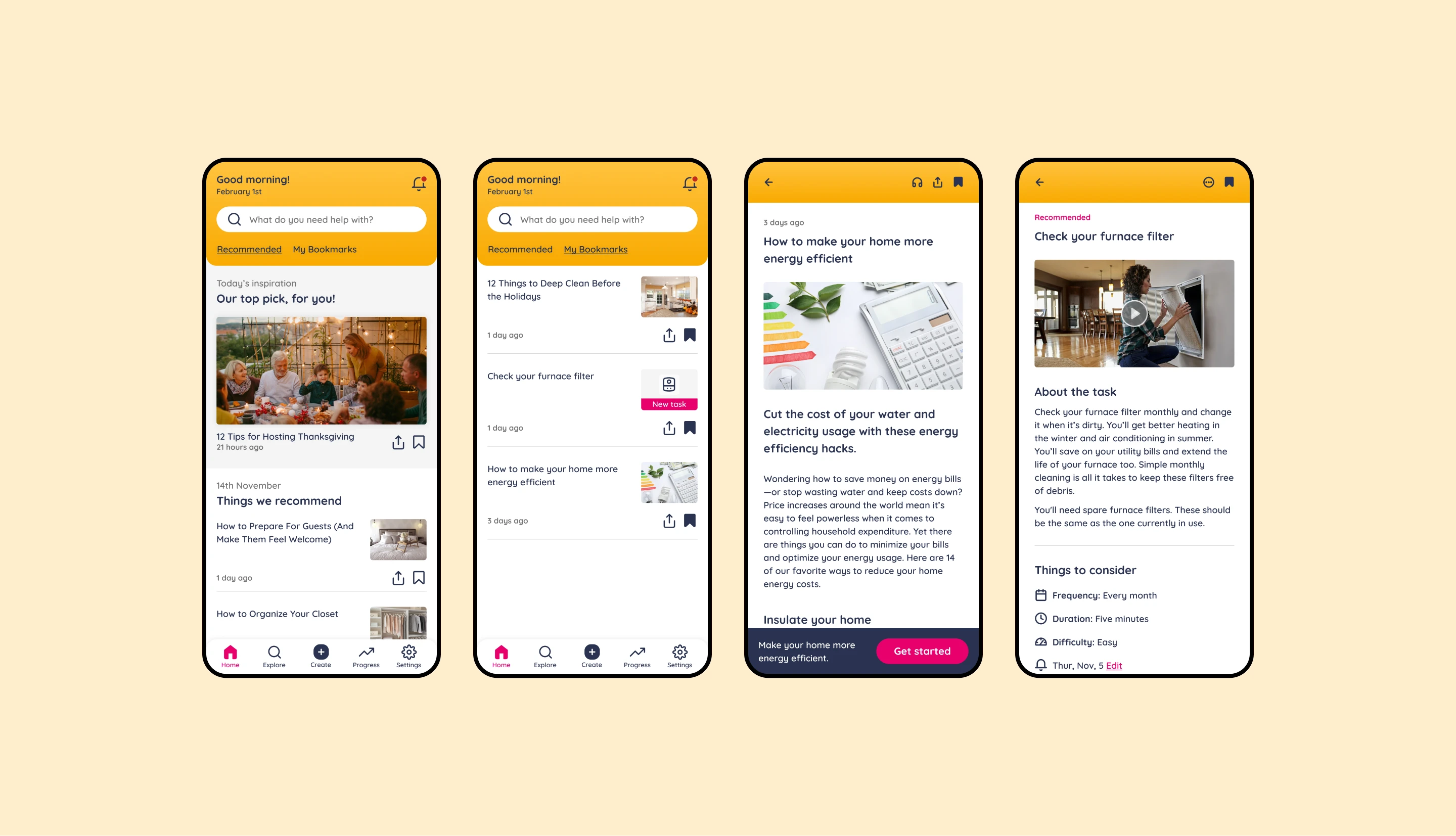
Not a list of tasks — a guide to the right action at the right time. Curated, prioritised, relevant. Homeowners shouldn't need to decide what matters; the product should do that work.
Give users control
Self-curation emerged across all three research rounds as an unmet expectation. Users intuitively wanted to add their own tasks, manage categories, and filter by relevance. That expectation was built in.
Make completion rewarding
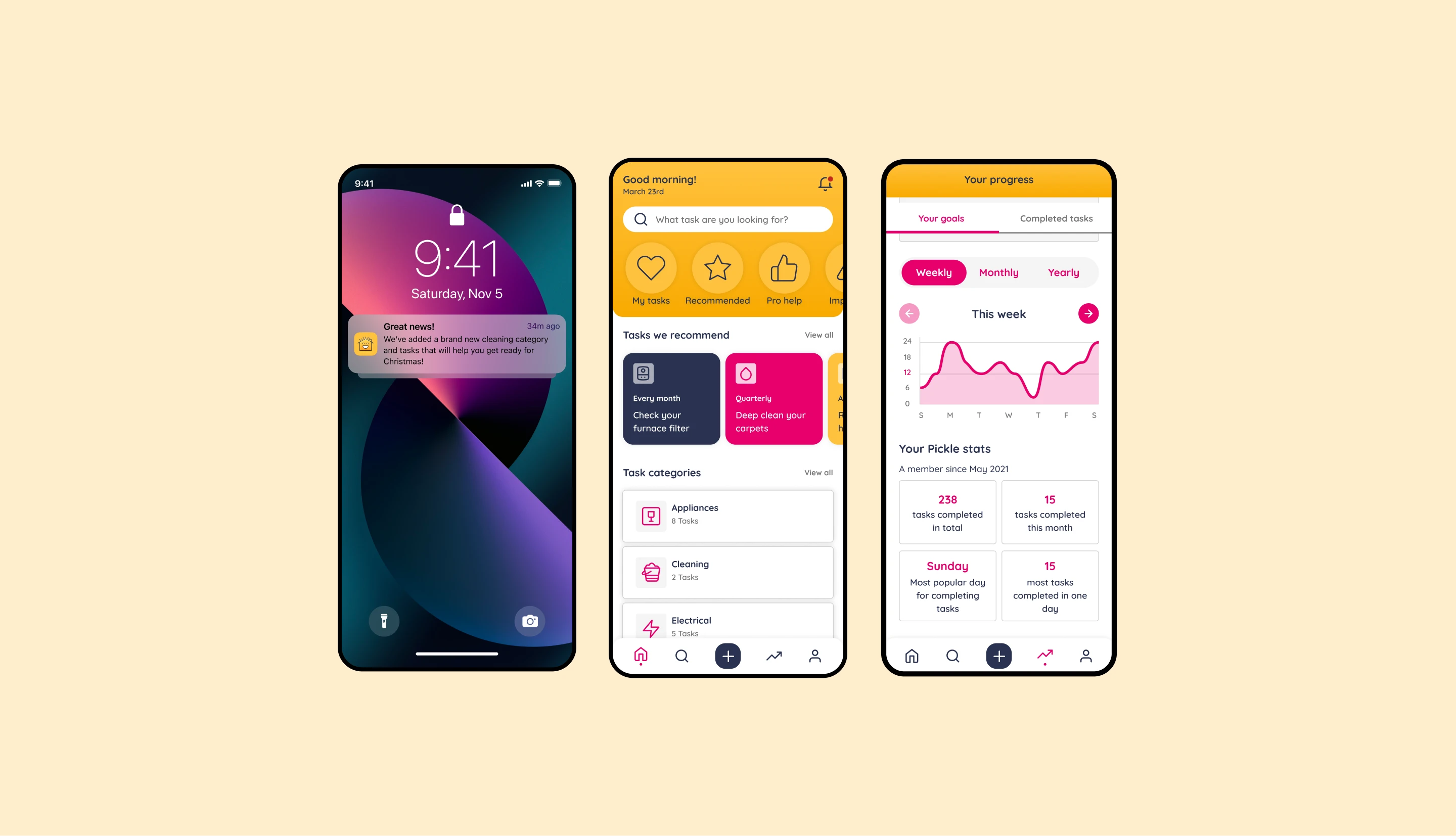
Progress indicators and home scores reinforced momentum. The task completion interaction was designed to deliver a small moment of satisfaction — the kind of detail that determines whether users come back.
Round 1 — baseline
14 tasks, 5 participants. SUS score of 75 — exceptional. Five insight themes extracted. Three of five users completed all tasks. Navigation and plan creation identified as primary friction points.
Round 2 — native Android
Post-iteration testing. Home care plan completion time fell 32%. NPS moved into detractor territory — authentication friction introduced by the native build, and recurring issues from Round 1 unresolved.
Round 3 — self-curation
Focused prototype. Three tasks, five participants, 80% success rate. Social sharing achieved 100%. Task discoverability remained the most persistent issue — pointing to an IA problem, not a surface fix.
Prioritisation
Three rounds produced a ranked backlog. Navigation architecture, home care plan creation and task discoverability were the same structural weaknesses showing up in different forms. Resolution before expansion.

Round 1 — establishing the baseline
Testing across 14 tasks with 5 participants. Three of five users completed all tasks successfully — a 60% success rate overall. The highest-friction task, creating a home care plan, averaged 4 minutes 13 seconds at a 60% completion rate.
Five themes emerged: navigation labels were inconsistent, with users navigating by trial rather than recognition; plan creation demanded too many upfront decisions with no clear mental model; progress data was welcomed but its representation confused users; adding tasks to My Tasks lacked a clear affordance; ease of use was strong, but multi-step flows broke confidence at predictable points.
Changes made: navigation relabelled and restructured; plan creation simplified with contextual guidance introduced at decision points; progress graph redesigned to communicate momentum more clearly; task-add action made contextually obvious.
Round 2 — native Android iteration
Significant shifts were visible. Home care plan completion time dropped from 4:13 to 2:52 — a 32% reduction. However, the NPS score fell from +75 to 60, moving into detractor territory. Authentication introduced new friction: three of five users attempted sign-up via Google, one failed; two used email — the auth model didn't match expectations.
Four themes emerged: onboarding still overwhelmed at entry; UX defects from Round 1 had not all been addressed; self-curated tasks had become a clear user expectation — users intuitively wanted to add items, manage categories, and filter by relevance; recurring feedback patterns signalled the need for a more disciplined defect triage process between rounds.
Changes made: onboarding simplified with skip logic and contextual re-entry; defect resolution formalised before new feature work; self-curation — custom task creation, category management, filtering — moved from nice-to-have to core feature.
Round 3 — self-curation validated
Focused prototype. Three tasks across five participants. Two users failed one task; one failed two — an 80% overall success rate. Finding a task completed at 60%. The social and story-sharing feature was the standout: 100% task success across all participants. NPS recovered to +40.
Four themes emerged: navigation structure continued to cause hesitation — the IA needed a cleaner top-level model; plan creation required further simplification around question specificity; task discoverability was the most persistent issue across all three rounds, pointing to an architectural problem rather than a surface fix; the task completion interaction was broken in the prototype but the expectation it revealed was clear — completion needed to feel rewarding, not just functional.
Changes made: IA resolved at the top level before individual flow optimisations; dedicated task-finding model introduced with clearer search and browse patterns; completion interaction redesigned for a moment of reward; onboarding question specificity tightened to improve first-run personalisation. Social layer fast-tracked based on Round 3's 100% result.
Interface design
The interface was rebuilt around three principles the research consistently reinforced: clarity of what to do next, confidence that progress is real, and control over what's relevant. Messaging moved away from obligation and toward care, wellbeing, and reward.
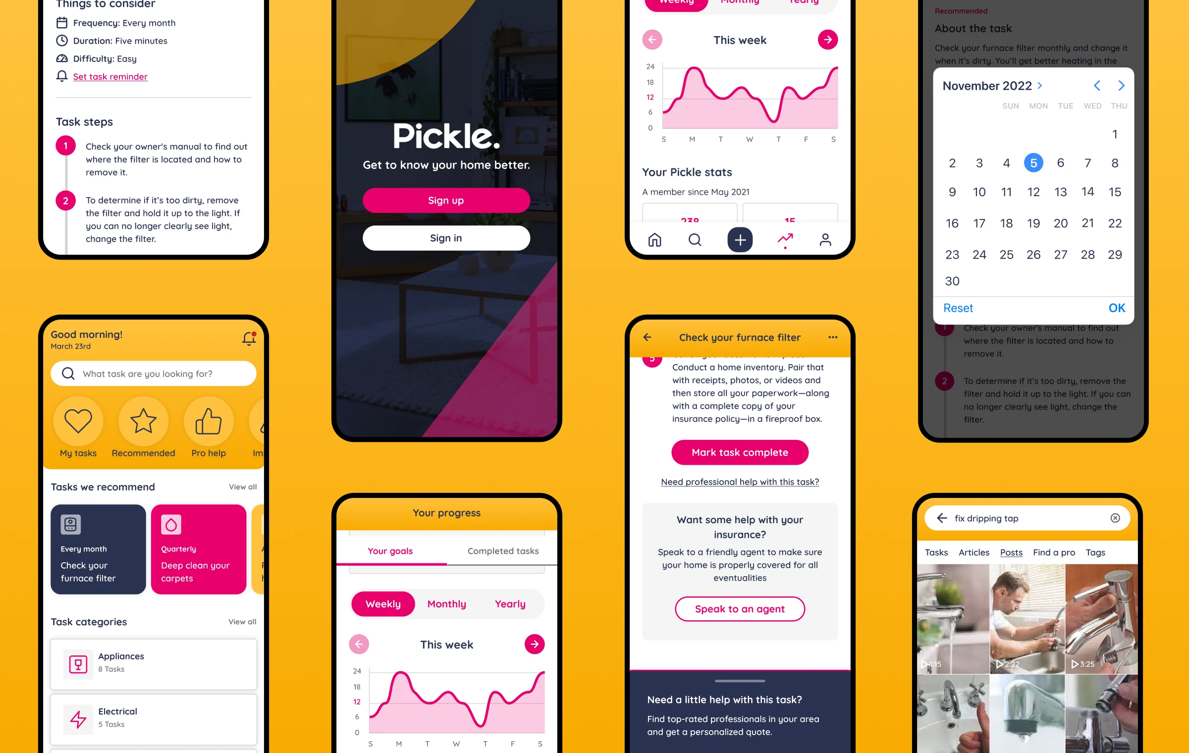
Navigation was restructured with clearer section labels and a more consistent tab model. The home care plan creation flow was compressed, with contextual guidance introduced at decision points and skip logic added throughout. The task completion interaction was designed to deliver a small moment of satisfaction — the kind of detail that determines whether users return.
Architecture
The native Android and iOS experience was built around modular task components, personalised dashboards, and scalable notification logic. Custom task creation, filtering, and category management were first-class features — not afterthoughts. In-app video and how-to guidance extended time-in-app and reinforced task completion.
The architecture was designed to support Pickle's expansion into insurance, contractor referrals, and financial services. A one-stop resource for home care, suppliers, and property history — built to scale beyond the first version.
A companion, not a checklist
Completion time
↓ 36%Home care plan flow. Structural changes to decision sequencing cut the most complex task by more than a third across two rounds.
Usability score
75 SUSExceptional by industry standard. Maintained across the first two rounds as the interface was restructured rather than simplified.
Social feature
100%Task success in Round 3 testing. Fast-tracked to core based on this result — the clearest signal across all three rounds of what users responded to.
Self-curation
ShippedCustom task creation, category management, bookmarking and improved search — moved from nice-to-have to core based on consistent user behaviour across all three rounds.
Designed to be a companion,
not a checklist.
The most important thing the research surfaced wasn't a usability failure — it was a product framing problem. The interface was being judged against a feeling, not a feature set. Users weren't leaving because they couldn't complete tasks. They were leaving because the product didn't feel like something worth returning to.
Three rounds of testing made that visible in a way no amount of assumption-based design would have. The decisions that improved the product weren't the obvious ones — they were the ones the research pointed to, precisely because they weren't obvious.