Zoomies
Brand identity and UX for a challenger US pet insurer — built to disrupt a crowded, clinical market.
Full brand identity and digital product design for a budget-first US pet insurer — from visual language to conversion-focused quote journey. The brief: make affordability feel like a choice, not a compromise.
- Visual identity system
- Campaign direction
- Landing page design
- Quote journey UX
- Social assets
- Physical concepts
Making pet insurance feel joyful, not transactional.
The US pet insurance market is crowded and emotionally charged. Competitors position themselves around reassurance, seriousness, networks and complex plan comparisons. The tone is often clinical or corporate.
Zoomies aimed to win a different audience. Budget-conscious pet owners who care deeply about their animals but feel priced out or put off by traditional providers.
The brand needed to signal affordability without feeling cut-price. Emotional connection, yes — but not sentimental. And it had to work at billboard scale and on a 375px screen.
"Budget-conscious customers are highly price-aware but time-poor. They want transparency and speed."
Research synthesis, quote journey discovery
Three design decisions. One coherent brand.
Rather than softening the budget positioning, the strategy embraced it. The work covered brand personality, visual identity, and a conversion-first quote journey. Each one had to earn its place.
Brand strategy
Warm, direct, and unapologetically budget-first. Affordability repositioned as a confident choice — not a compromise. Language that acknowledges constraints without shame.
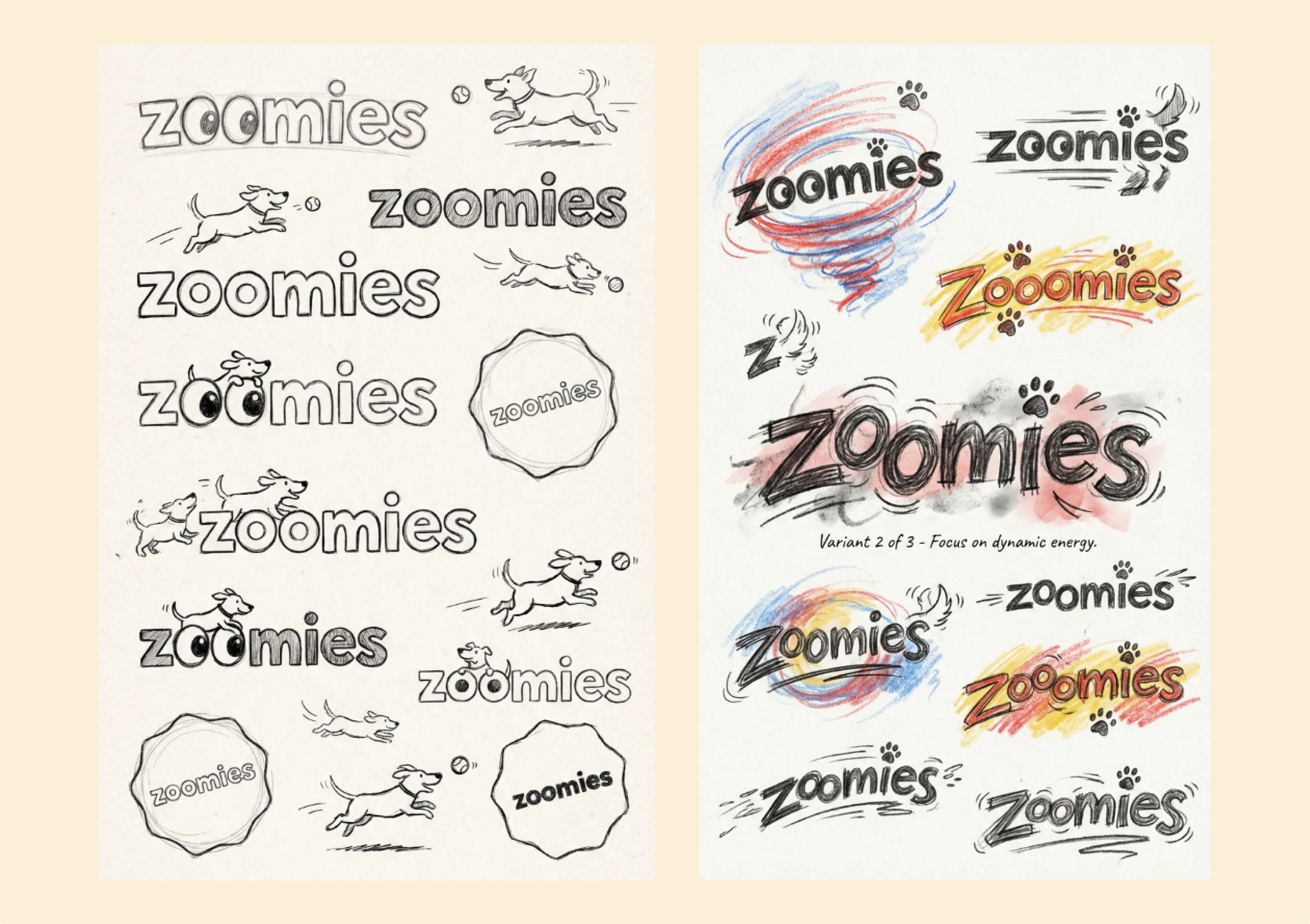
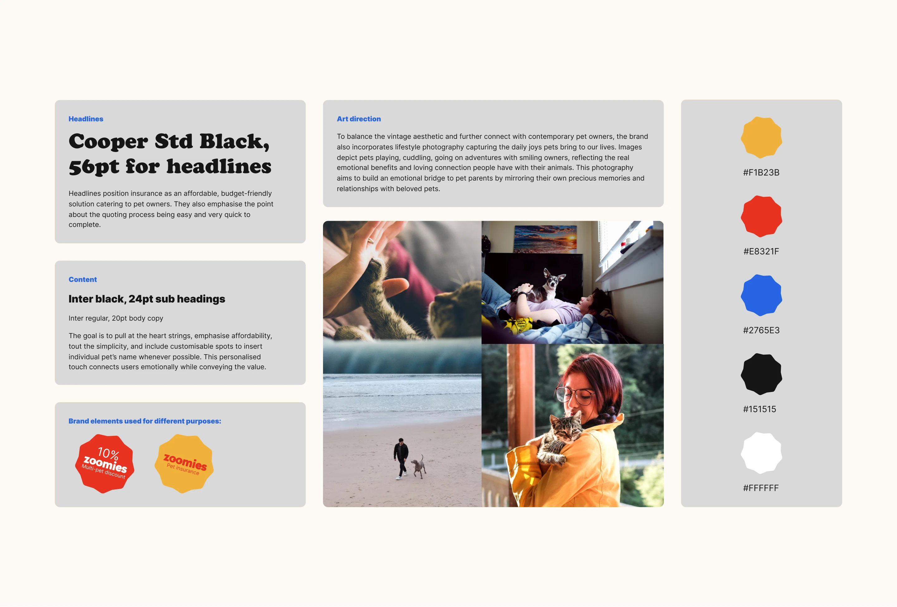
Visual identity
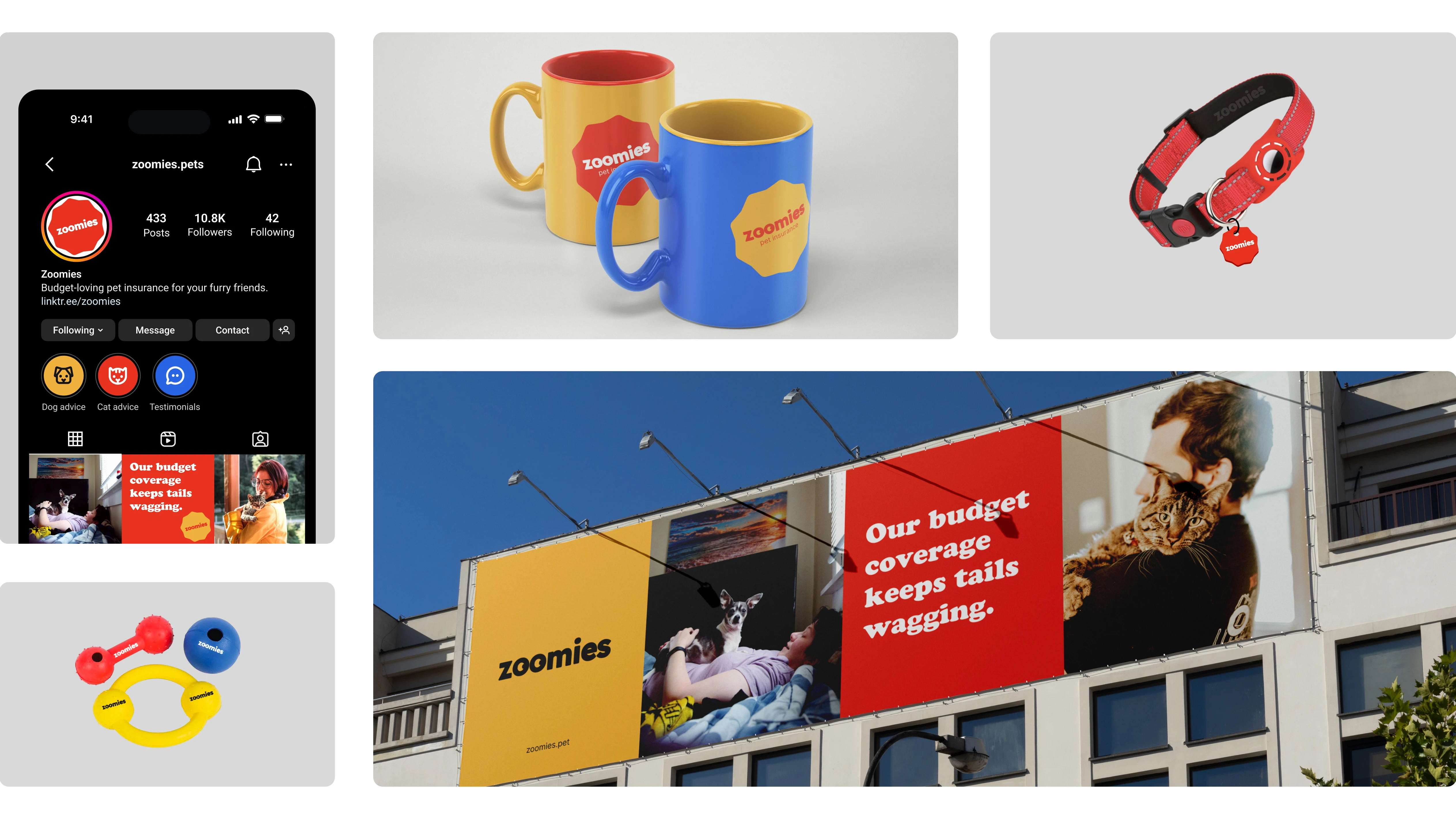
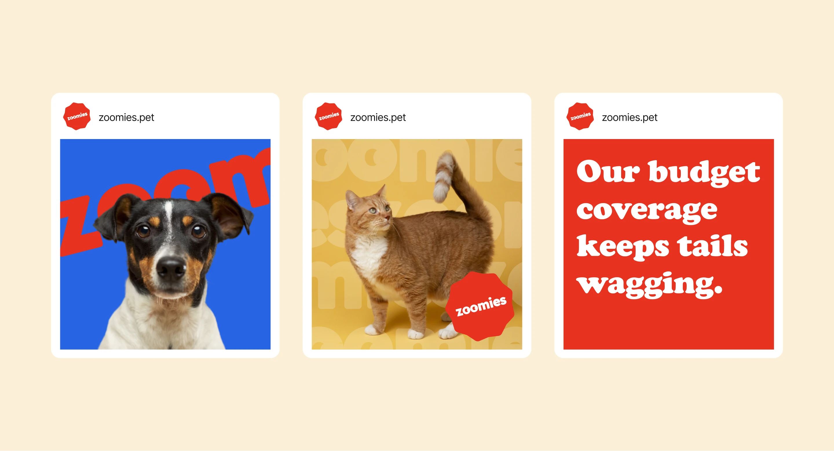
Primary colour blocking with red, yellow and blue. A soft-edged badge mark. Real pet photography to ground the brand in authenticity without veering into novelty.
Quote journey
Conversational, stepped flow. Pricing surfaced early to reduce abandonment. Plan comparison built for speed — reimbursement, limits and exclusions clear before commitment.
Brand encounter
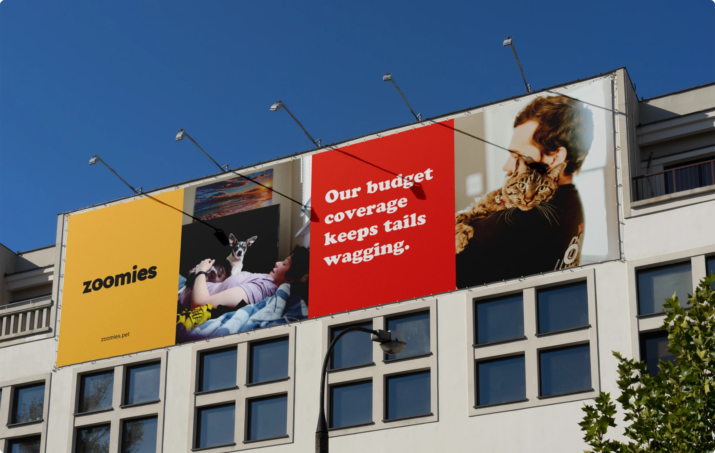
OOH, social and digital. Emotional connection established before any product detail. The name Zoomies doing most of the work.
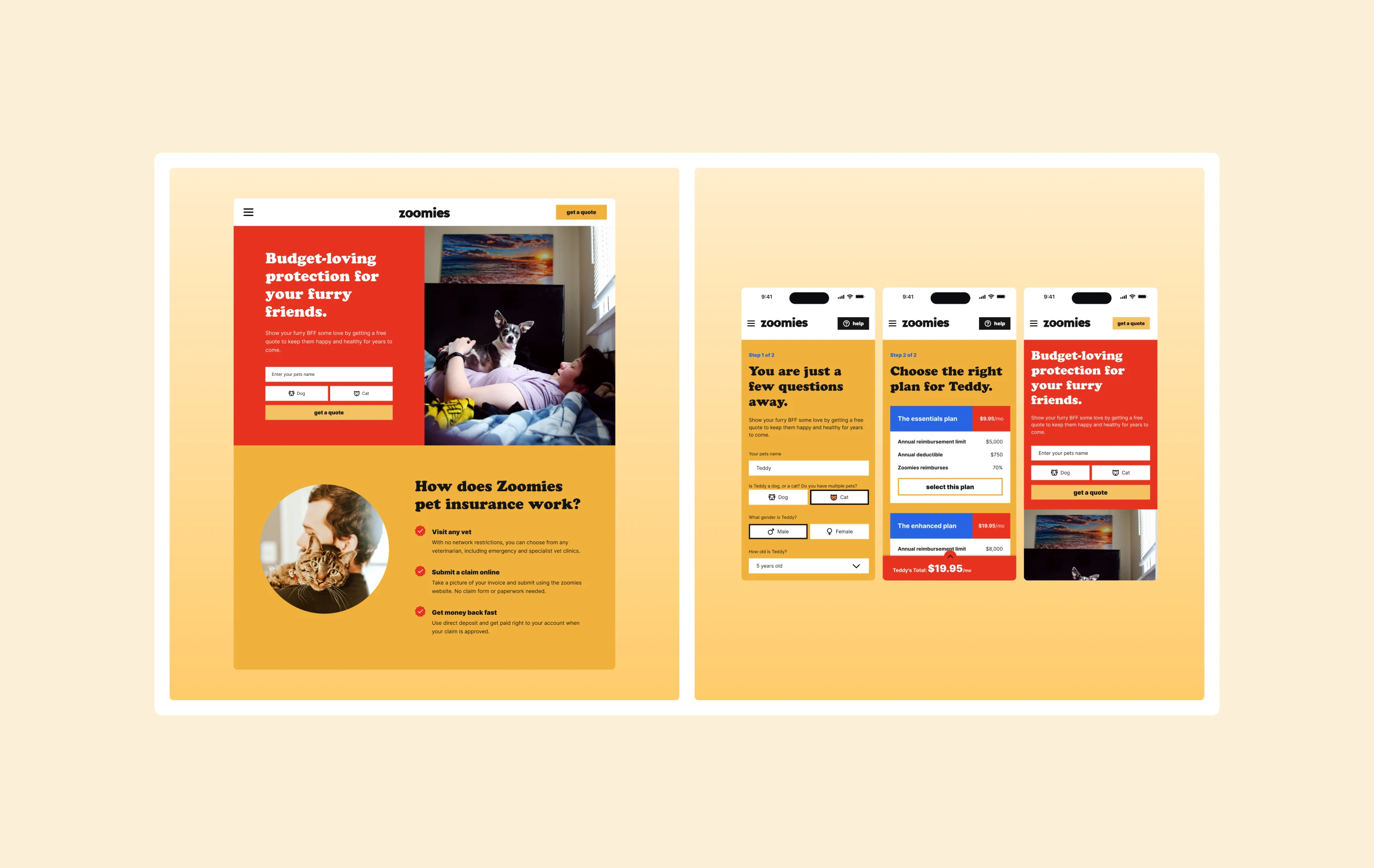
Landing page
Emotional headline first, three-step explanation second. Value proposition before form. The interface earns the click before asking for anything.
Pet details
Simple, conversational questions. Minimal fields. Each screen reinforces progress and maintains the brand voice throughout.
Plan selection
Comparison cards with transparent pricing. Reimbursement levels, annual limits and exclusions laid out clearly. Fast to read. No buried small print.
Visual identity
Zoomies used primary colour blocking with red, yellow and blue to create instant recognisability. A soft-edged badge mark reinforced affordability without appearing discount-led. Bold, friendly typography shifted into novelty when needed.
Real pet photography grounded the brand in authenticity. The creative direction balanced colour blocking with genuine moments to avoid feeling visually alienating.
Design system
The identity system was modular. New channel, same system. No manual adaptation per placement. Built to scale as distribution expanded.
The quote flow incorporated early pricing signals to reduce abandonment. Plan selection screens emphasised transparent value propositions. Social executions leaned into relatable pet-owner moments, reinforcing emotional connection while maintaining budget positioning.
A brand built to scale
Brand system
ModularA complete visual identity scalable across digital, print and outdoor without per-placement adaptation.
Quote journey
SteppedConversational flow that surfaces pricing early to reduce abandonment at plan selection.
Multi-channel
ScalableCampaign direction extended to social, print banners and OOH — demonstrating real-world scale from day one.
Positioning
DistinctAffordability repositioned as a confident choice. Warm, direct tone that no competitor in the category was occupying.
Making affordability feel like
a choice, not a compromise.
The brand decision everyone avoids: how do you signal value without signalling cheap? The answer was to embrace the positioning rather than soften it. Bright colour, direct language, real pets. Budget-first becomes a statement.
Zoomies didn't try to look like a premium insurer. It tried to look like the right choice for someone who knows what they want.